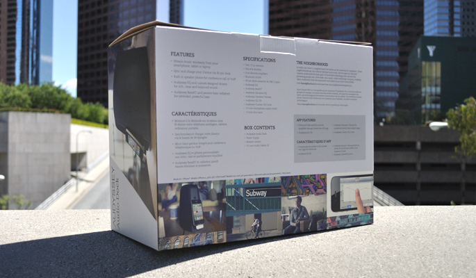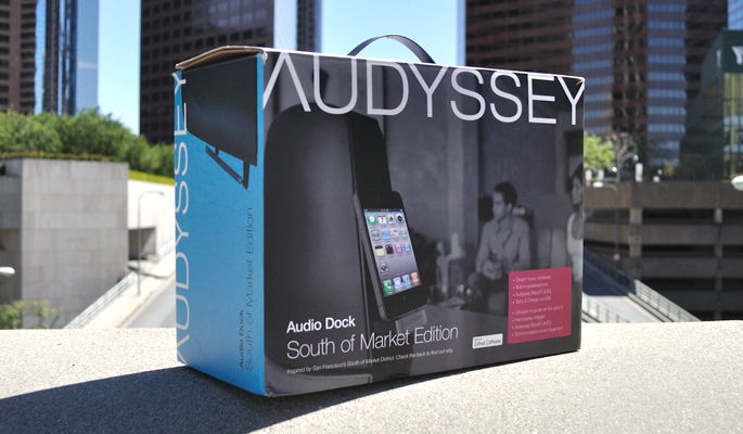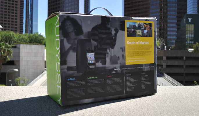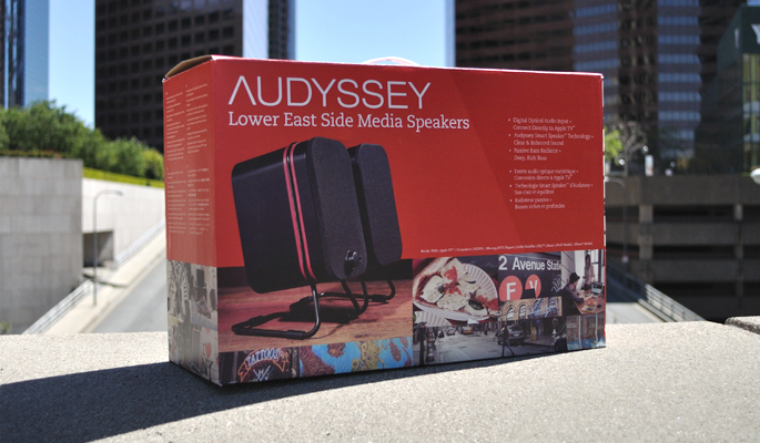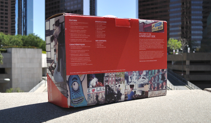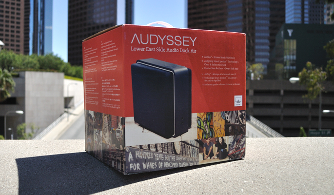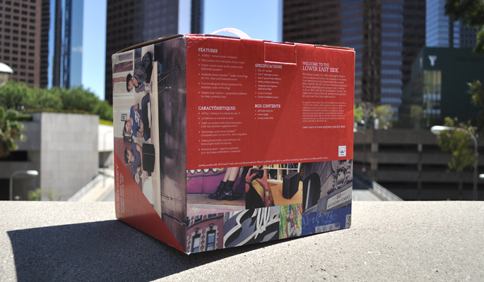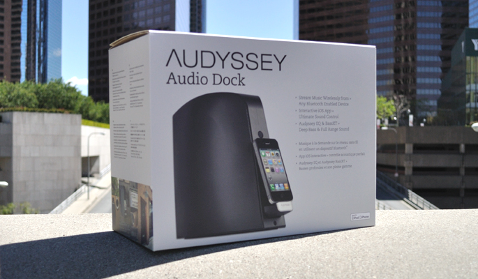
Audyssey’s three products have gone through a few packaging iterations. This family of products was first based on a neighborhood convention, in which different products would live under certain real neighborhood names (the first product was South of Market, the second was Lower East Side). This neighborhood connection inspired image collages to evoke the feelings of that city.
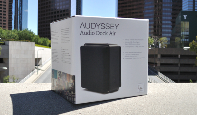
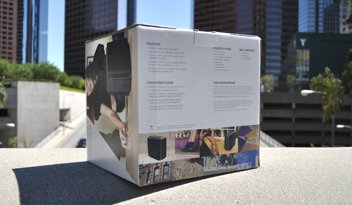
The neighborhood naming convention was later dropped and Audyssey wanted to elevate its color story. The box color shifted from a vermillion to a cool grey and the front of the box was simplified.
Skills: Packaging design, photography, art direction

